Colour palette


Our vibrant colour palette includes a flexible range of contrasting shades to create visually appealing, accessible content. Primary and secondary palettes provide a variety of complementary tones and tints.
Please follow the colour usage and pairing rules on this page for each palette.
Primary palette
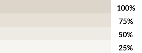
Our primary palette consists of teal, cream and blue. You can also use black and white. This provides some flexibility and supports accessibility, allowing you to create contrast and provide alternatives to stark white backgrounds.


Bold teal


Soft cream

Deep blue


Black/white

Usage
Use these primary colours first across all platforms and content. You should only use the cream for backgrounds, while you can use other colours for text, icons and graphical devices.
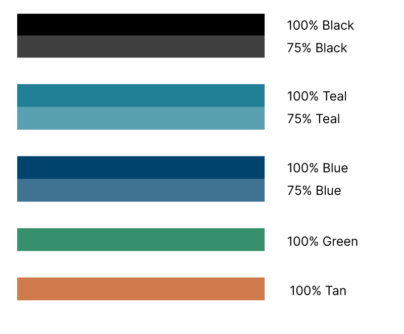
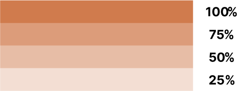
To add more depth and variety, and to ensure consistency, you can apply each colour in tints of 100%, 75%, 50% and 25%.
Secondary palette
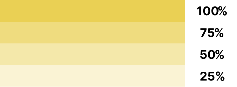
The secondary palette consists of 4 colours: yellow, pink, green and tan. We have chosen these to complement the primary palette and provide extra contrast to improve accessibility.


Positive yellow

Warm pink

Balanced green

Natural tan


Usage
The secondary palette is for when you need more colours beyond the primary palette. Yellow and pink should only be used as highlight colours in infographics and illustrations, whereas green and tan are for use within graphs and charts, alongside colours from the primary palette. You should not use these colours in any other way, as this can compromise accessibility.
To add more depth and variety, and to ensure consistency, you can apply each colour in tints of 100%, 75%, 50% and 25%.


An example of how to use this colour pairing rule
An example of how to use this colour pairing rule
Colour pairing rule
You can only use 1 secondary colour at any time, alongside any number of primary colours (apart from in graphs and charts, where both green and tan can be used together alongside the primary palette colours for maximum flexibility and contrast).


An example of how to use this colour pairing rule
An example of how to use this colour pairing rule
Colour codes
You should use the HEX or RGB colour codes for digital products such as websites and PDF documents. You should only use the CMYK colour codes for printed items. Using CMYK colour codes within digital products will dull the colour palette.

Bold teal
- HEX: 228096
- RGB: 34, 128, 150
- CMYK: 77, 14, 0, 41

Soft cream
- HEX: DED5CA
- RGB: 222, 213, 202
- CMYK: 12, 13, 18, 0

Deep blue
- HEX: 00436C
- RGB: 0, 67, 108
- CMYK: 100, 37, 0, 57

Black
- HEX: 000000
- RGB: 0, 0, 0
- CMYK: 100, 100, 100, 100
White
- HEX: FFFFFF
- RGB: 255, 255, 255
- CMYK: 0, 0, 0, 0

Positive yellow
- HEX: EAD054
- RGB: 234, 208, 84
- CMYK: 0, 11, 64, 8

Warm pink
- HEX: EDD8CD
- RGB: 237, 216, 205
- CMYK: 0, 8, 13, 7

Balanced green
- HEX: 37906D
- RGB: 57, 145, 109
- CMYK: 60, 0, 24, 43

Natural tan
- HEX: D07B4D
- RGB: 209, 124, 77
- CMYK: 0, 40, 63, 18
Colour codes - tints


Bold teal 100%
#228096

Soft cream 100%
#DED5CA

Deep blue 100%
#00436C

Black 100%
#000000

Bold teal 75%
#59A0B0

Soft cream 75%
#E6E0D7

Deep blue 75%
#407291

Black 75%
#404040

Bold teal 50%
#91C0CB

Soft cream 50%
#EEEAE4

Deep blue 50%
#80A1B5

Black 50%
#808080

Bold teal 25%
#C8E0E6

Soft cream 25%
#F7F4F1

Deep blue 25%
#BFD0DA

Black 25%
#BFBFBF

Positive yellow 100%
#EAD054

Warm pink 100%
#EDD8CD

Balanced green 100%
#37906D

Natural tan 100%
#D07B4D

Positive yellow 75%
#EFDC7F

Warm pink 75%
#F2E2D9

Balanced green 75%
#69AC91

Natural tan 75%
#DC9C7A

Positive yellow 50%
#F4E8AA

Warm pink 50%
#F6ECE6

Balanced green 50%
#9BC8B6

Natural tan 50%
#E7BDA6

Positive yellow 25%
#FAF3D4

Warm pink 25%
#FBF5F2

Balanced green 25%
#CDE3DA

Natural tan 25%
#F3DED3
Accessibility
To ensure text legibility meets the government-required WCAG 2.2 AA accessibility standards, you should use the following colour pairings and type sizes. To ensure accessibility when using teal text, use a minimum font size of 18pt.
Examples of accessible colour pairings


Examples of inaccessible colour pairings

Teal text on blue

Blue text on teal

White text on cream

Black text on blue

Black text on teal
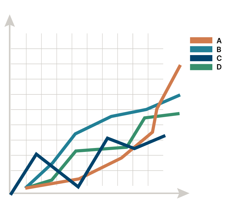
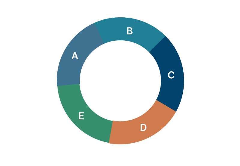
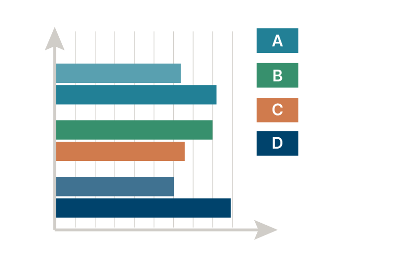
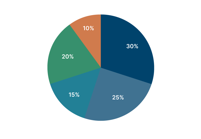
Graphs and charts
You may use the primary and secondary palette to improve contrast in graphs and charts.
Note: yellow and pink should not be used to present data within graphs. You should also avoid using any of the percentage tints in this way. Within pie charts, you should ensure sufficient contrast between adjacent segments.