Iconography


Icons can be used to help communicate information or instructions to our audiences. You can also use icons to illustrate key messages and pieces of content. Our icon style is clear and consistent.
Icon versions
Icons are available in 3 flexible formats – outline, fill and circular – and 3 colours – teal, blue and white. You can use the outline and fill icons online, including social media, and print. The circular icons should only be used within PowerPoint.
A wide range of useful icons are available in our icon gallery (internal link only). If you need a new icon, please contact the brand and marketing team to discuss your request. External agencies contracted by NICE should contact the brand and marketing team to request icon artwork files as needed.


Icon colours
To ensure enough contrast, and make sure the icons are used in an accessible way, use teal or blue icons against white or light backgrounds. White icons should be used against darker backgrounds. Use alternative (alt) text to ensure icons are accessible to all users.


Outline - teal

Outline - blue

Outline - white

Fill - teal

Fill - blue

Fill - white

Circular - teal

Circular - blue

Circular - white
Icon usage
Here is an example of how our icon set could be used on our corporate social media channels. Icons are adequately spaced when they are used together. At least half the size of the icon’s width separates each icon.

Download our corporate PowerPoint template from the brand guidelines and templates page of NICE Space (internal use only) for examples of the circular icons in use within PowerPoint.

Icon creation*
*This guidance is for in-house and contracted graphic designers only.
When creating icons, follow these guiding principles to ensure our iconography remains consistent. You should create icons in all 3 variations: outline, fill and circular.

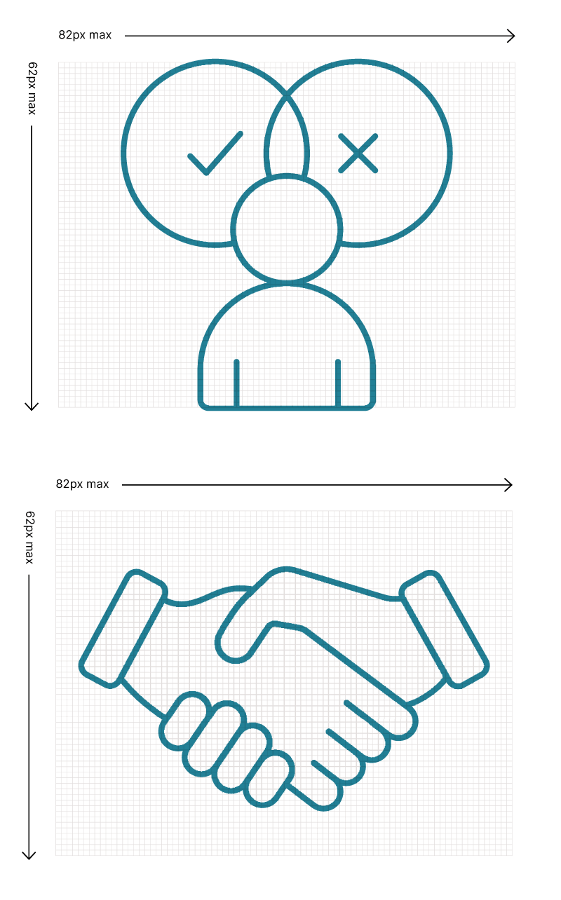
- Use a grid of 82x62 pixels (px).
- Icons should use a 1px stroke in both the fill and outline style. Use a stroke weight of 0.75px for the circular icons. These should have a diameter of 56px.
- Icons should use simple geometric forms and not be over complicated.
- Icons should always use rounded corners.
You may scale icons up once you have created the initial form. When you enlarge icons in size, ensure that you scale up strokes proportionally.


 Built with Shorthand