Illustration


We have developed a unique illustration style. It is intended for very limited use, for example within animations or social media content created or commissioned by the NICE Communications Directorate. This guidance is for in-house and contracted graphic designers only and these illustrations should not be used in everyday applications such as PowerPoint.
Characters
Characters are at the heart of our illustration style, especially health and care staff and the public. When selecting characters, a diverse range of people from a variety of ethnicities and genders should be represented.
Simplicity
Our characters are facially featureless. The only exception is accessories worn on the face, for example goggles or glasses. Limited detailing of clothes or objects and flat colours keeps illustrations simple. Characters are drawn face-on with a symmetry tool to create clean, tidy and proportional line-art.
Character proportions

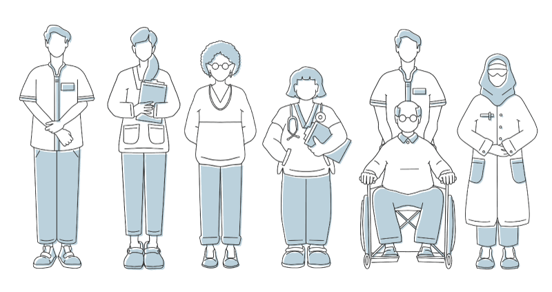
Characters have realistic human proportions. Limbs or other parts of the body are not exaggerated.


Colour usage

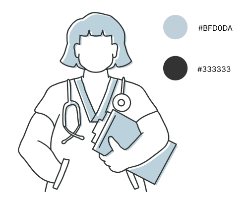
The line-art is in 80% black (#333333). The illustrations include a slightly offset fill in a 25% tint of deep blue (#BFD0DA). The offset is towards the bottom right of the page The illustrations only ever sit on a light background.
Stroke breakdown
The stroke width is 2pt. The stroke has a rounded cap and rounded corner to give a softness to the illustrations. No textured/artistic brushes are used. Only the pencil or pen tool in Adobe Illustrator or the monoline brush in Procreate are used.

