Typography


To ensure accessibility and legibility follow the rules set out below regarding font hierarchy and minimum sizes. Avoid block capitals, italics and vertically oriented or curved text.
Fonts
Primary font
Inter is our primary font for use on all body copy and low-level headings. Or you can use Arial.


Secondary font
Lora SemiBold is our secondary font for use on top-level headings only. Avoid underlining this font. Alternatively, please use Arial.


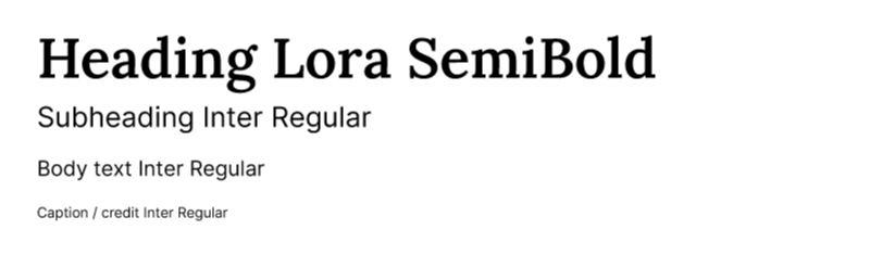
Hierarchy and usage
The following example shows how you should use these fonts to show information hierarchy.

Typography misuse examples


Do not use block capitals.

Do not use italics.

Do not use weights that are not included within the brand guidelines.

Do not rotate typography.
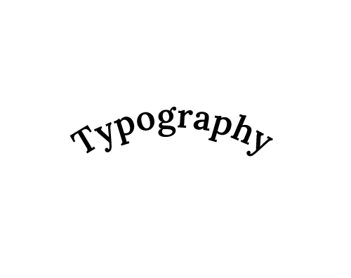
Do not use curved typography.
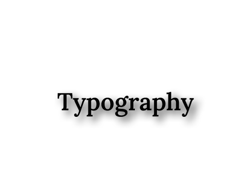
Do not use drop shadows or any other effects on typography.
